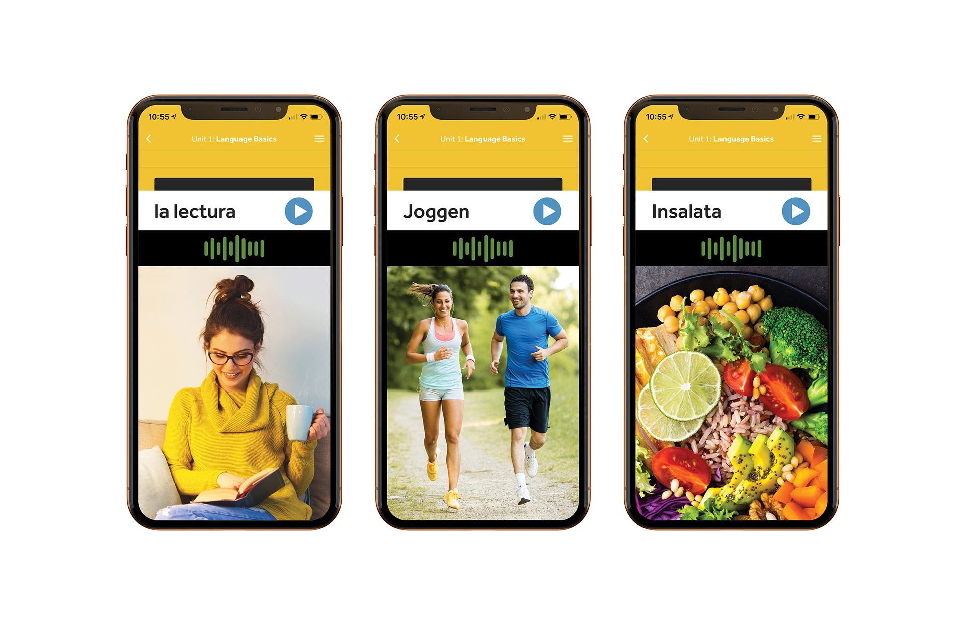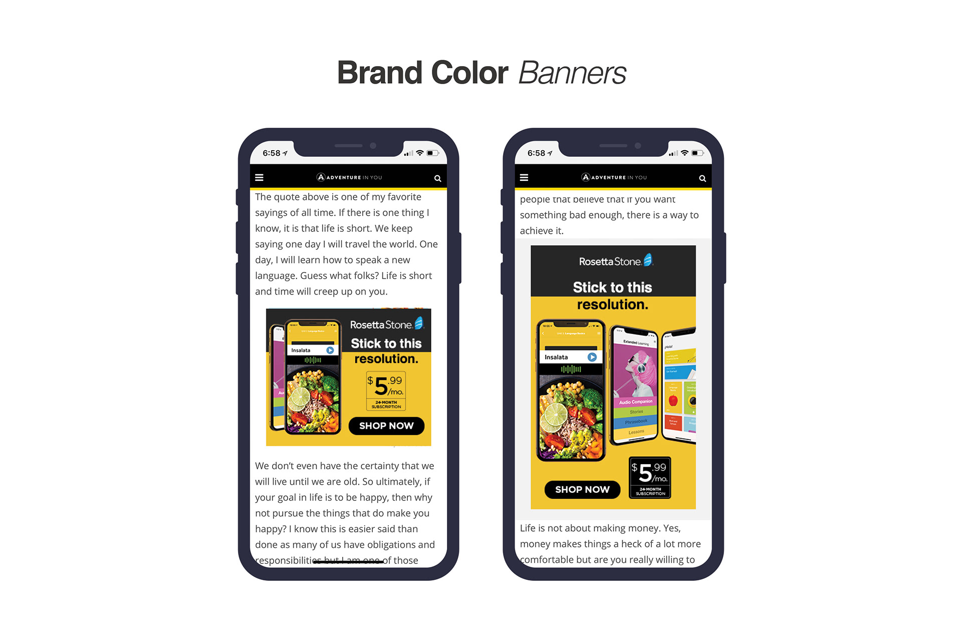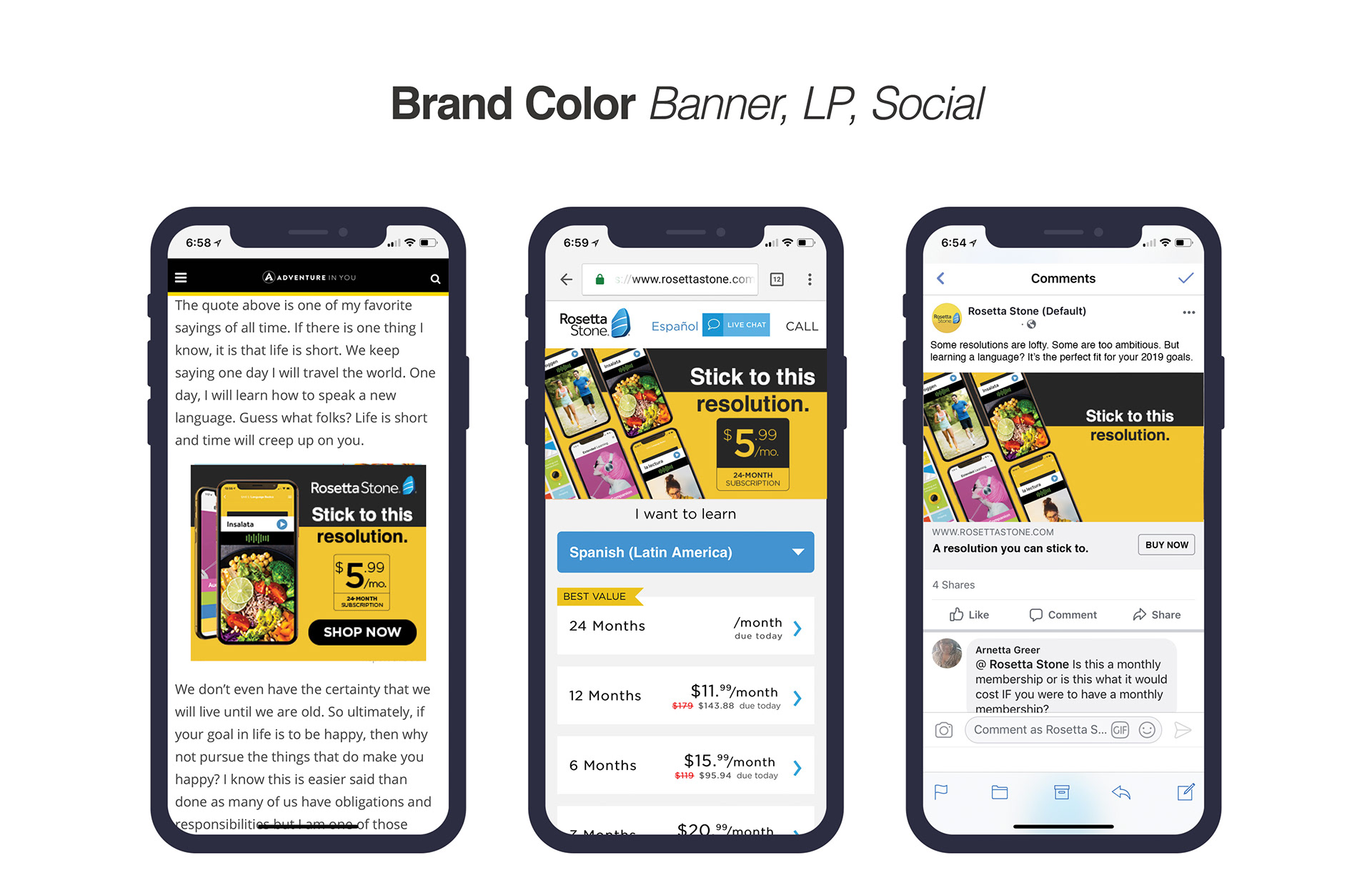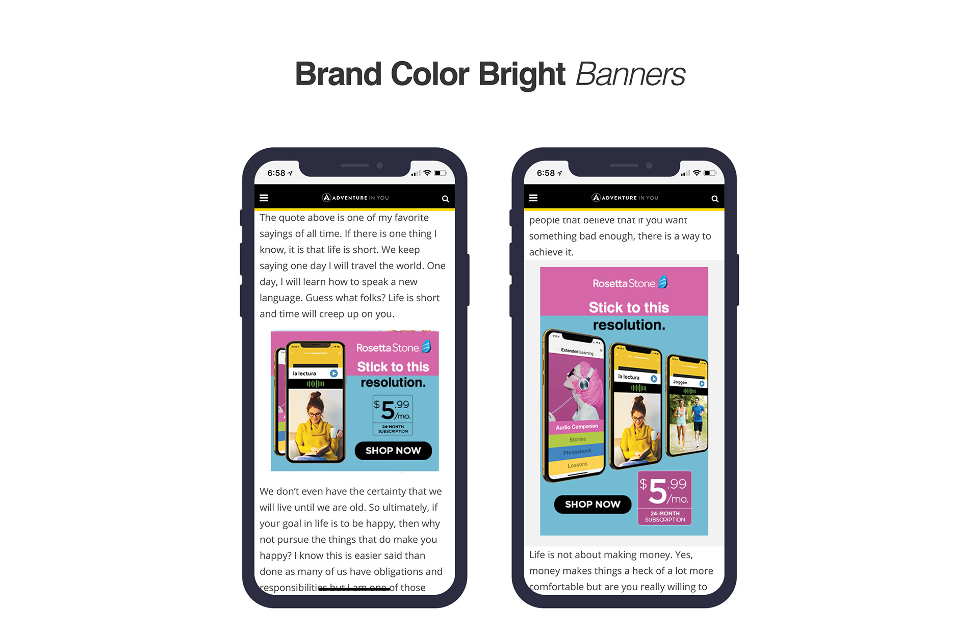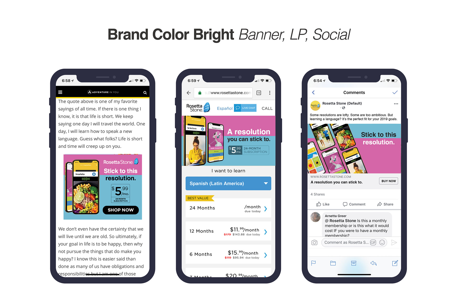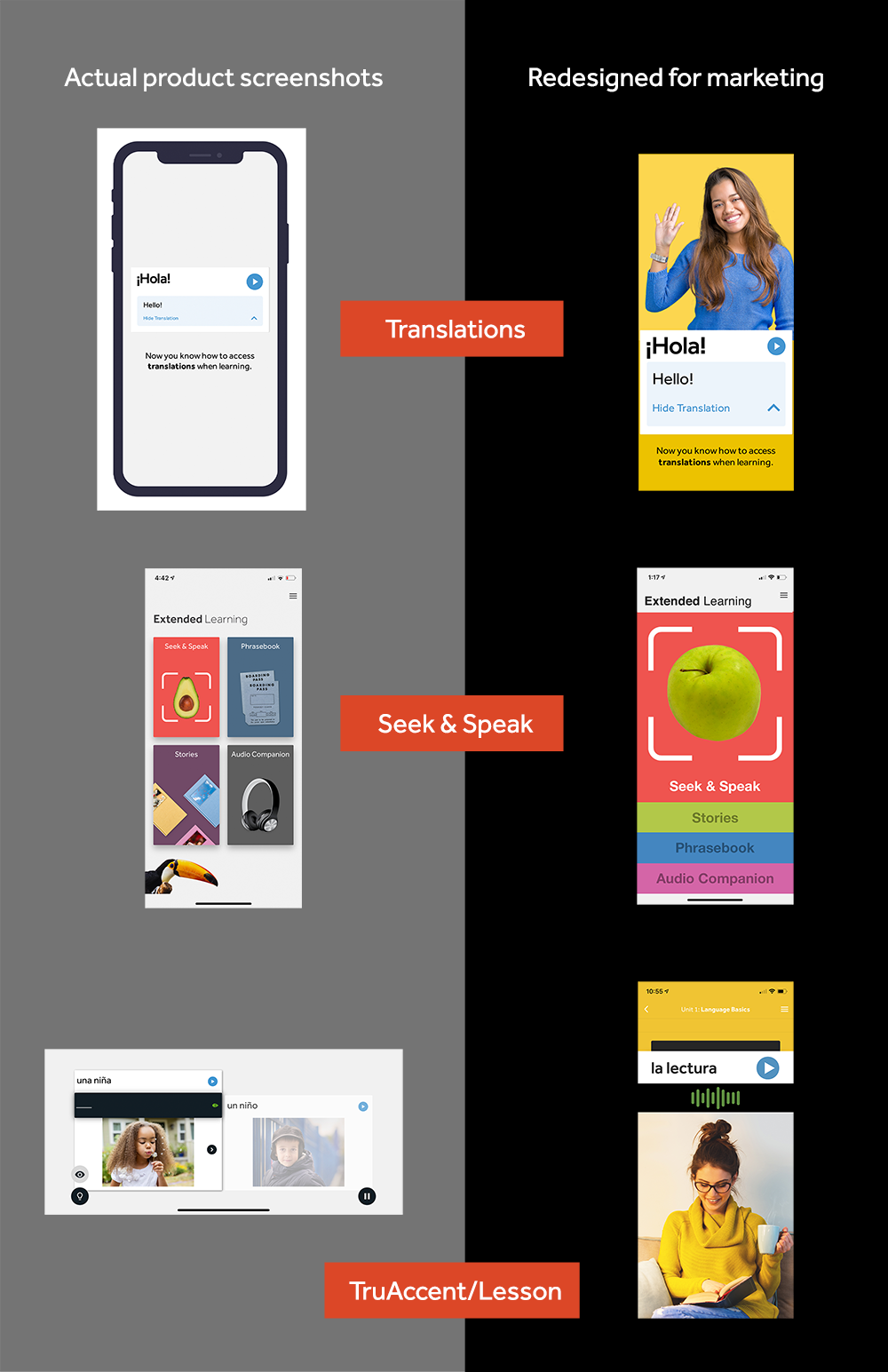


The Resolutions art direction represents a strategic shift away from the overused, holiday-themed narrative, aiming to establish an "evergreen" message for Rosetta Stone that resonates throughout the year. This initiative was one of my most significant successes, as it involved refreshing the outdated, desktop-based designs with a modern and dynamic aesthetic. I crafted a visual identity intended to compete with the sleek, user-friendly designs of popular new applications, ensuring Rosetta Stone remained relevant and appealing in a rapidly evolving digital landscape. This fresh approach focused on creating an engaging and intuitive user experience, incorporating clean lines, vibrant colors, and interactive elements that reflect contemporary design trends. The revamped look not only enhanced the visual appeal but also improved usability, making the app more accessible and enjoyable for learners of all ages. Recognizing the potential impact of this redesign, I pitched the idea to the head of product development, emphasizing how the new art direction could position Rosetta Stone as a leader in the language learning market. The proposal was met with enthusiasm and marked the beginning of a transformative journey for the app's future. This innovative art direction set a new standard for the company's design philosophy, ultimately driving increased user engagement and satisfaction. Through this project, I demonstrated the power of forward-thinking design and its ability to reinvigorate a brand, ensuring that Rosetta Stone continues to inspire and support language learners around the world.
